
Dynamic Range, Tonal Contrast and (Squint) Medium Blur
At last fortnight's WSV demonstration, Fabio Cembranelli intentionally left more white paper than his reference photograph showed. He was painting the light itself, using negative shadow shapes and white paper to enhance luminosity. When asked, he confirmed this was deliberate. Human eyes perceive a far greater range of light than cameras can capture. Photographers have long known this and developed techniques to better represent these light levels, which they call the Dynamic Range of their equipment.
Ever wondered why your holiday photos look flat and grey while a professional's work seems to glow? It's all about dynamic range, the difference between the brightest whites and darkest blacks. Our eyes are remarkably good at seeing detail in both bright skies and dark shadows simultaneously. Cameras? Not so much. They have to choose what to expose for, often leaving you with either blown-out white skies or murky black shadows. Modern smartphones and cameras have gotten clever. Many now use HDR (High Dynamic Range) techniques, which takes multiple photos at different exposures and combines them, one catching the sky details, one for mid-tones, and one for shadows. The result? Photos that look more like what we actually see.
Photographers can also adjust tonal contrast after the fact, using tools like Curves and Levels. This is digital-age "Dodging and Burning", selectively lightening or darkening parts of an image. It's not cheating; it's helping the photo match what your eyes witnessed in that moment.
The challenge? When you're viewing photos on screens (which emit light) versus prints (which reflect light), things looks different. Not everyone's screens are set up the same, making it tricky to ensure your photos or artistic vision translates consistently.
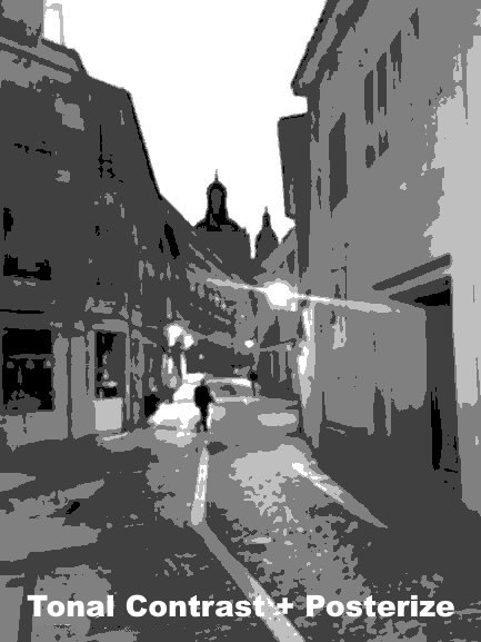
For this week's photo, I enhanced detail in the dark areas using an S-curve adjustment, which boosts local contrast in darker tones while slightly compressing highlights. The original dusk image appeared quite dark and monotone, but it isn’t.
First, I desaturated the image to eliminate colour distractions. Then I created a 5-step posterized version showing only five grey shades, simplifying shapes while preserving the scene's essence. With all tones darker than mid-grey merged, as suggested often by Andy Evanson, isolating the focal points.
Next, I undid the posterization, then restored the original colours, a step often revealing brighter, clearer hues with their murkiness removed.
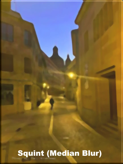
Finally, I applied a median blur technique, which groups pixels and adjusts them to the median colour and tone value (half above, half below the median) for the group. This creates simplified, cohesive shapes in both tone and colour, giving the image a more painterly quality.
Maybe a good place to start your painting.